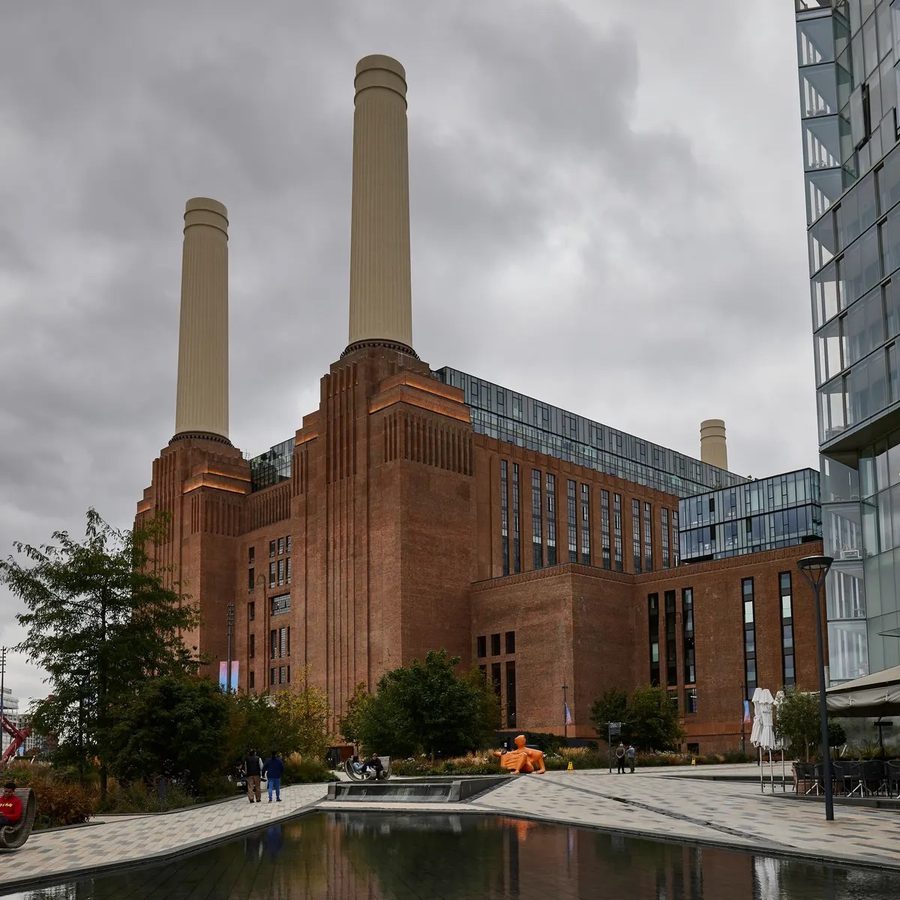
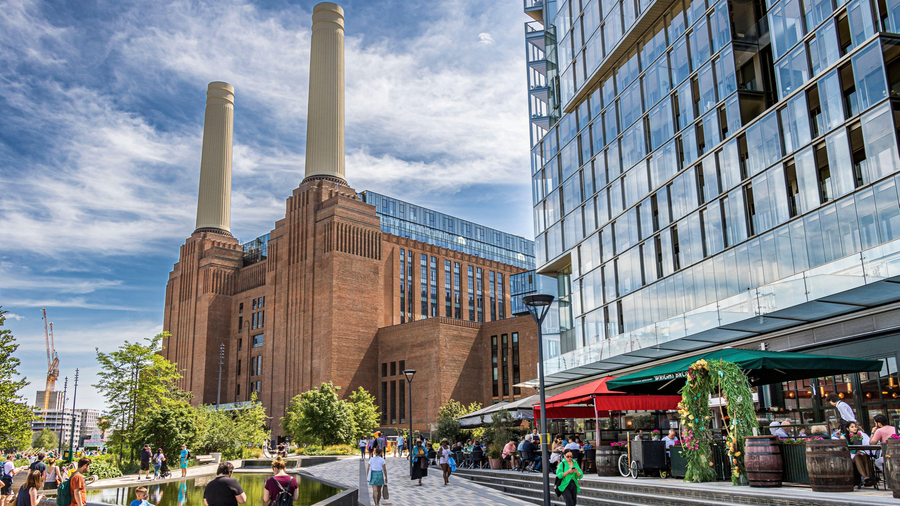
Battersea Power Station Review
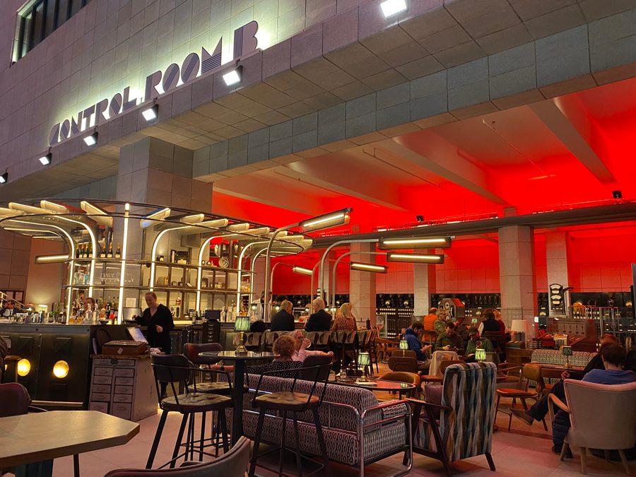
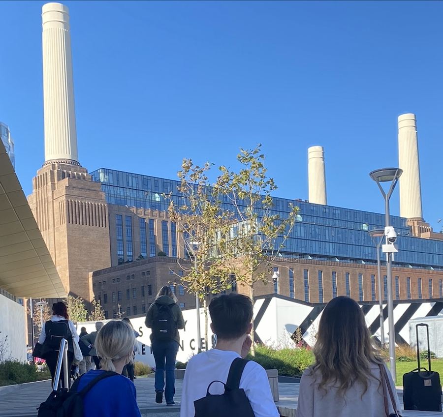
Battersea Power Station finally opened to the public and a group of us from Dalziel and Pow went to explore. The reborn icon, Battersea Power Station has been surrounded by hype and conversations about what new retail spaces and developments could be, therefore we felt we had to see first-hand what the buzz was about. We decided to take a specific area to focus on based on our expertise, with the intention to present an internal review to the whole team back in the studio. Attending a week after it had opened on a weekday, we wanted to experience what it would feel like during a more ‘normal day’ without the crowds and initial rush.
The team consisted of three environment designers (Elena, Macy and Jovita), two branding and communication designers (Ethan and Evie) and a strategist (Emma ). Whilst it may sound like the start of a bad joke, the mix allowed us to cover the narrative, architecture, retail, hospitality, communications and digital content.
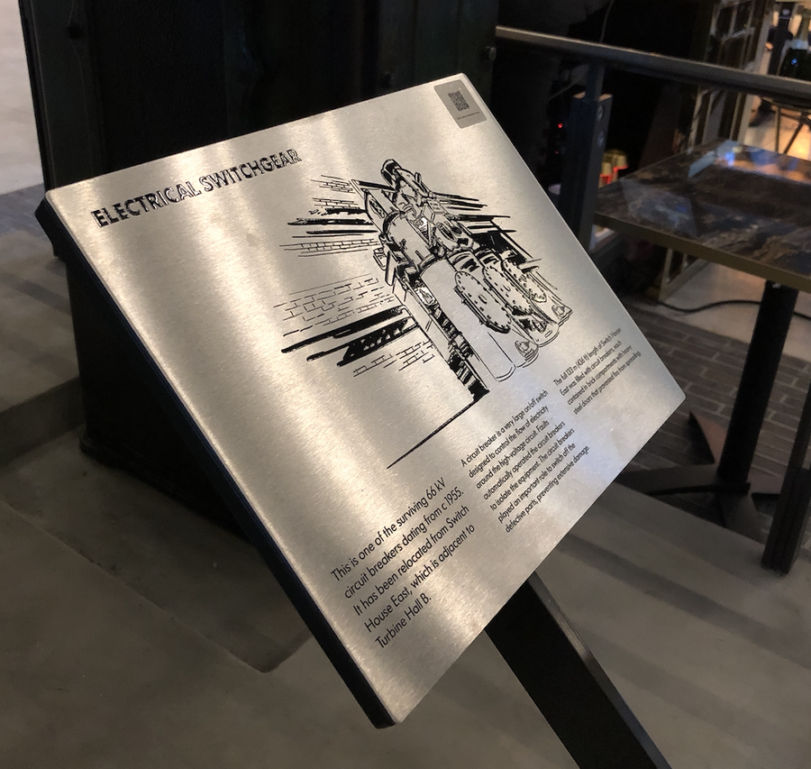
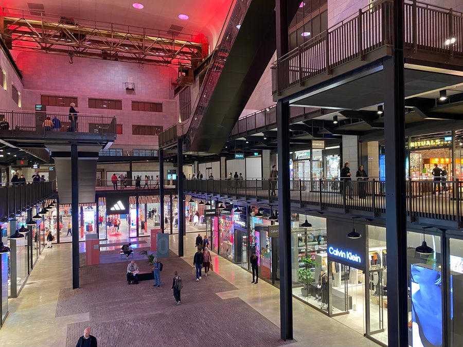
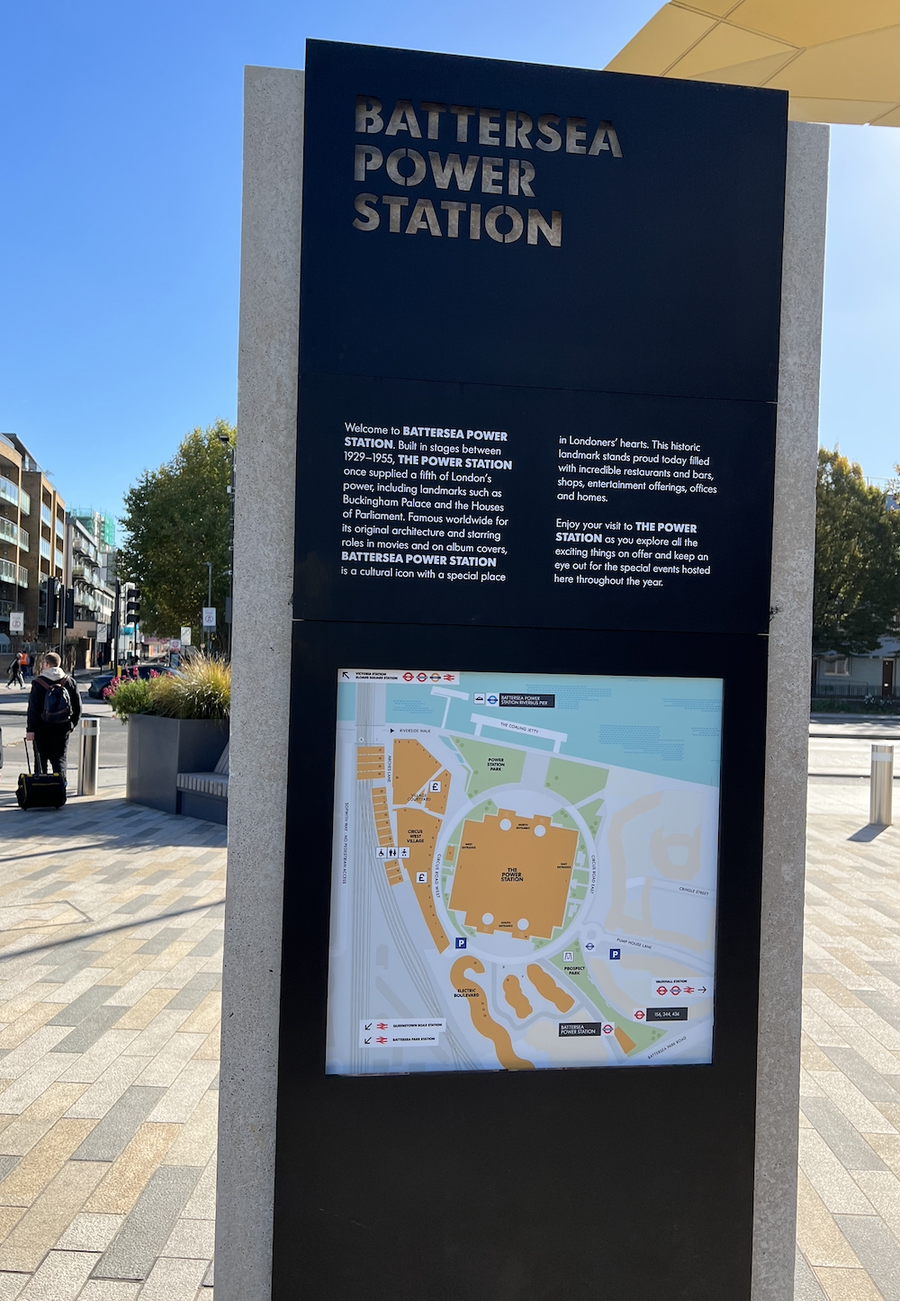
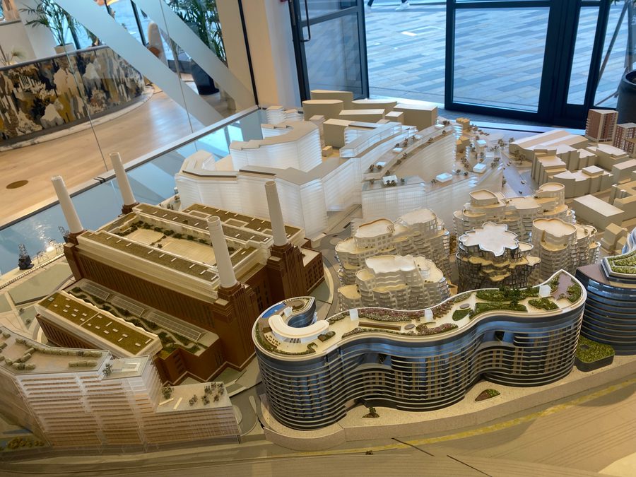
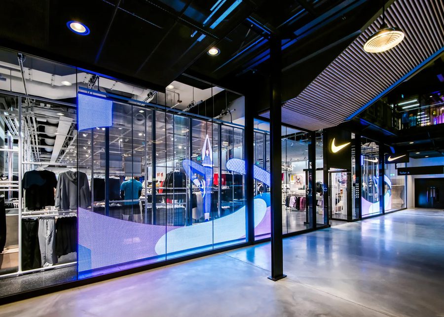
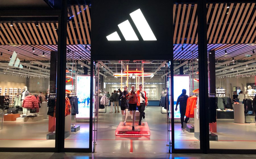
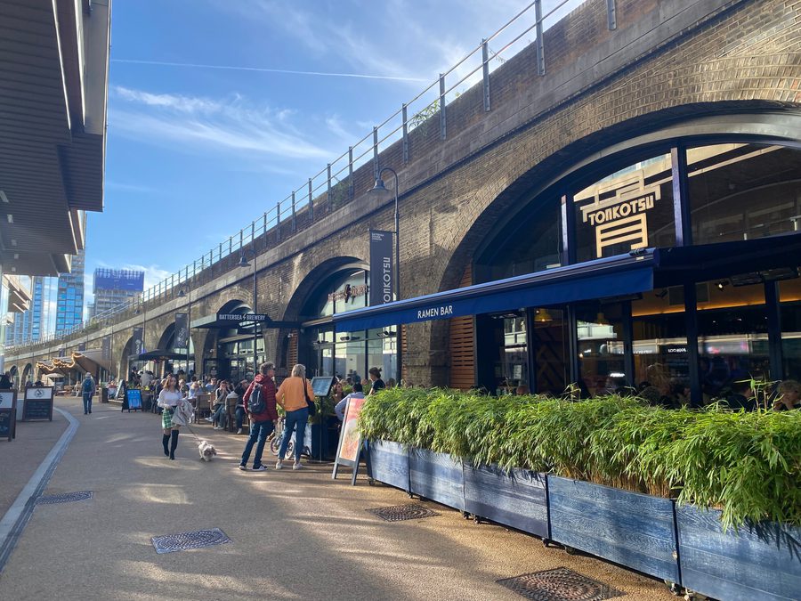
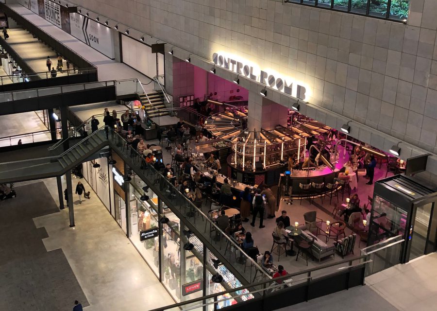
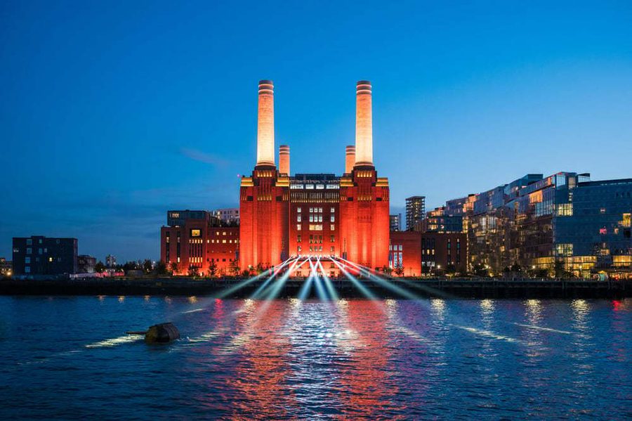
The history of the many attempts to restore and reuse London’s design icon is fascinating, with the large price tag reflecting what a mammoth task it was (the numbers are currently at £9 billion). The overall ambition of the development is to create a new neighbourhood and business quarter for London with the aim of creating a local community that all eight phases will help support, which in theory sounds like a great opportunity and purpose. Whilst our review only covers phase two of the Power Station (with a focus on the shopping mall) there are some important areas and controversies (such as the lack of affordable homes being built) currently making waves through headlines that are worth a read.
I have added some links below for anyone interested in the History, Renovation, Masterplan & Controversies of Battersea Power Station.