
Etude House
House of colour play
House of colour play
As part of a brand repositioning, Etude House’s flagship store experience and retail formats to be reimagined. The existing store’s distinctive pink dolls house-inspired façade suited the previous Princess Fantasy concept perfectly but didn’t exactly match up with the brand’s new direction. To appeal to customers with a more mature mindset, we were asked to transform the flagship brand experience, looking at the experience strategy, retail environment, communications and digital elements. They wanted to feel connected to their existing image, yet more grown-up.
Following a deep dive into the world of Korean cosmetics, their target customer and global trends we created a destination concept where customers can be creative with cosmetics - the “House of Color Play” – aligning Etude House with creativity and colour, as opposed to the sugar-sweet image that existed before. The new experience brings a creative and confident attitude while staying true to the brand’s playful spirit.
Key insight: The target audience is more creative and visually inspired than ever before, we need to position Etude as ‘a creative brand that sells cosmetics’
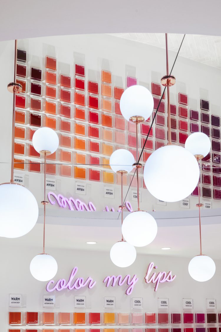
Filled with colour, charm and fun, the space has the feel of a playful home with a blend of classic and modern details. There’s plenty of individualised experiences throughout the store with a Personalisation Studio, My Color Finder and My Color Draping – all to help the Etude fans engage with the product in playful and shareable ways.
Strategic shift: From a ‘sugar-sweet’ store to an iconic home of creativity and play
The concept has been rolled out across Etude House's retail portfolio to reflect the brand's repositioning in stores worldwide


Though the iconic rose-coloured roof remains, we introduced a secondary palette to balance the brand’s trademark pinks.
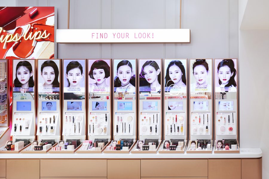
Highlighting the brand's expertise, we used local weather data to promote products on digital screens, letting customers know the ideal products for certain conditions.

The Color Factory is where customers can blend bespoke lipsticks. They can then choose their favourite case and have it engraved with their name, giving a completely individual product.


“ Personalisation and experimentation are at the heart of Dalziel & Pow’s transformation of Etude House.” Stephanie Campisi
Echochamber


