News

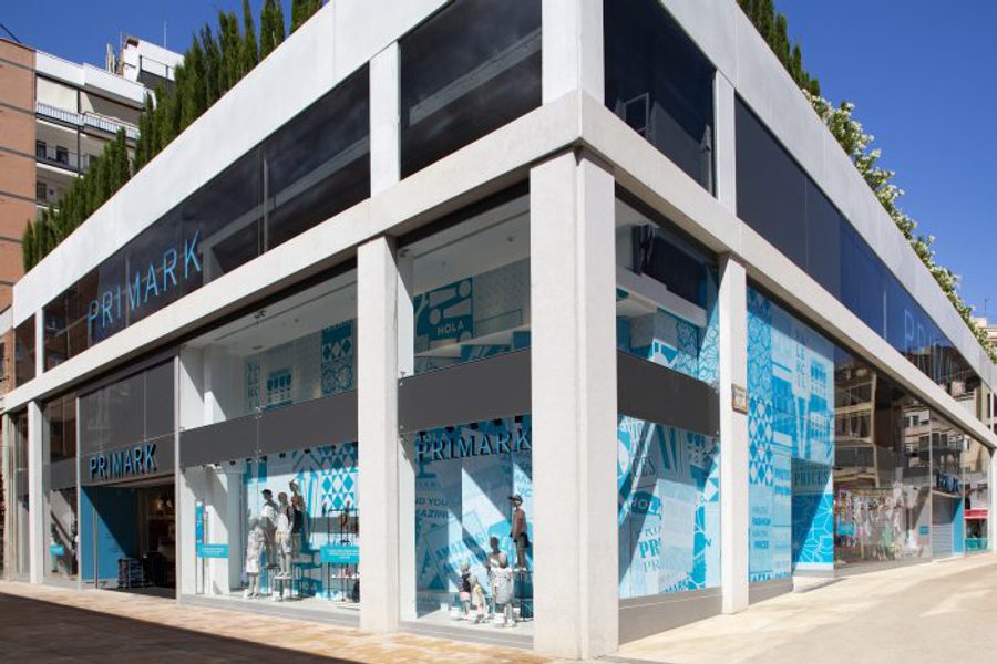
Our bespoke graphics debut at Primark Valencia

We created bespoke graphics for Primark's new store in Valencia, Spain that are inspired by the city's vibrant and diverse art scene.

Dalziel & Pow
By Dalziel & Pow
Posted 21. 09. 2018
CL9 Valencia Ruzafa photo 7276 e1537522314986

Local visual culture has inspired the concept for Primark’s flagship in Valencia, Spain.

The main source of inspiration for our work with Primark lay in Valencia’s own diverse and exciting street art scene. From an outdoor gallery (where walls, doorways and entire buildings have been transformed into works of remarkable beauty and ingenuity) to the urban typography and also the architecture that sees traditional patterned tiles and hand-painted street signs existing alongside peeling layers of posters. The in-store graphics, unveiled in June 2018, capture the spirit of the city and form an expressive backdrop for visual merchandising.

CL9 Valencia Ruzafa photo 7276 e1537522314986

One standout feature is the fly-poster window treatment in Primark’s brand colour Aqua (‘flyposting’ referring to the guerrilla marketing tactic of pasting advertising or flyers in illegal places). Its richly layered, concertina effect presents different visuals depending on the viewer’s direction of approach and creates a truly architectural brand statement. Bespoke illustrated city maps have become a signature feature of ourlong-running partnership with Primark, and the Valencia version has a strong, graphic style that complements the fly-poster concept and illustrative style.

CL9 Valencia Ruzafa photo 6913 e1537522344372

On the atrium wall, a huge keyline illustration of city landmarks becomes a backdrop for more colourful super scale posters and Valencia-inspired typography is used to communicate key Primark brand statements. From the tongue-in-cheek murals by Spanish visual artist Escif, to Raquel Rodrigo’s floral embroidery that adorns buildings, the city’s underground art scene provided rich, locally relevant inspiration.

CL9 Valencia Ruzafa photo 8014 e1537522360657

The graphic palette evolved from the ‘the hidden extrovert’ concept that references the store’s out-of-the-way location – reached via various passageways – and the fact that it’s a modern building nestled among historical architecture. It adds another exciting element to Primark Valencia’s customer experience, building on the store’s success and popularity since opening its doors in June 2018.

CL9 Valencia Ruzafa photo 8165 e1537522378481

arrow-down icon arrow-left icon arrow-right icon back icon button-box_2_blocks icon button-box_3_blocks-c icon button-box_3_blocks-d icon button-box_3_blocks-stacked icon button-box_3_blocks icon button-box_4_blocks icon button-box_5_blocks-alt icon button-box_5_blocks icon caret-down icon close icon d-p icon dot icon dots-column icon dots-nine-01 icon dots-trio icon facebook icon fast-forward icon forward icon hamburger-cross icon hamburger icon instagram icon letter icon link icon linkedin icon mail icon pattern-dots-white icon pattern-dots icon pattern-smile-white icon pattern-smile icon pattern-wave-white icon pattern-wave icon pattern-zig-white icon pattern-zig icon pause-button icon pink-waves icon play-button icon rewind icon search icon smile-column icon smile-trio icon squares icon twitter icon wave-column icon waves-citrine-line icon waves-citrine-square icon waves-rect icon waves icon youtube icon zig-line-pink icon zig-line icon zig-square icon